Frïz
An ice cream brand as intense as New Zealand
Snapshot
Overview: Brand ID & packaging for a New Zealand-based ice cream company
Role: Brand strategy, naming, identity, packaging, and copy
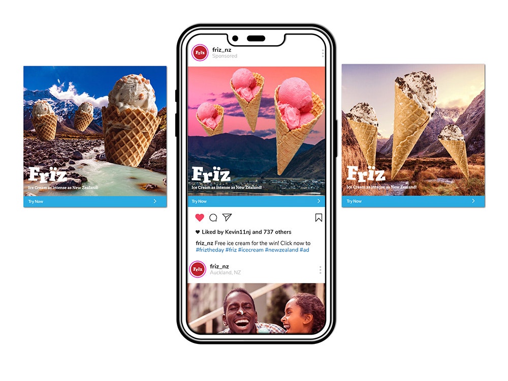
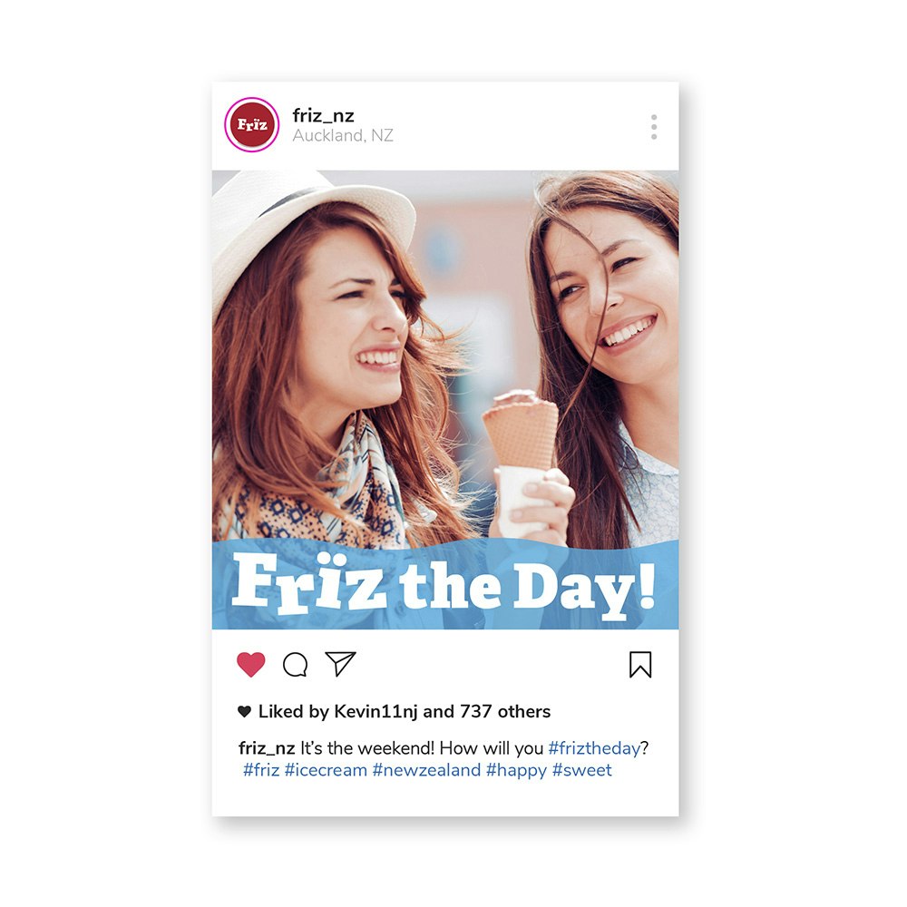
Deliverables: Brand concept, name, visual identity, packaging design, copywriting, flavor naming, digital and social ad concepts
Type: Concept
Target Audience
Adventurous, health-conscious consumers who embrace the outdoors and seek bold, memorable experiences in both lifestyle and food.
The Challenge
In a crowded market where competitors all claim to be fresh, natural, and sustainable, how does a new ice cream brand stand out?
The Insight
New Zealand itself is the differentiator.
Few places in the world offer such dramatic contrasts: mountains, fjords, glaciers, volcanoes, and coastline — all within a relatively small landscape. That intensity mirrors the bold flavors and textures of the ice cream.
Brand Concept
Ice cream as intense as New Zealand.
The brand leans into scale, movement, and contrast — turning the landscape into an active participant rather than a backdrop.
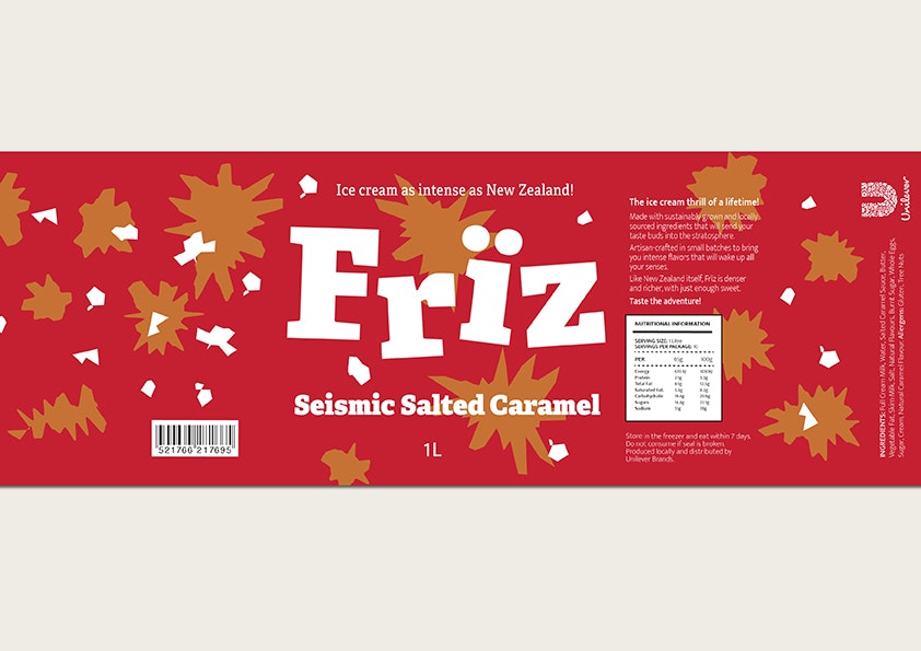
Brand Name
Frïz
Pronounced “freeze.”
Inspired by the idea of a sudden thrill or sensory jolt, the name reflects both temperature and intensity. The umlaut adds visual energy while reinforcing the sharp, memorable sound.
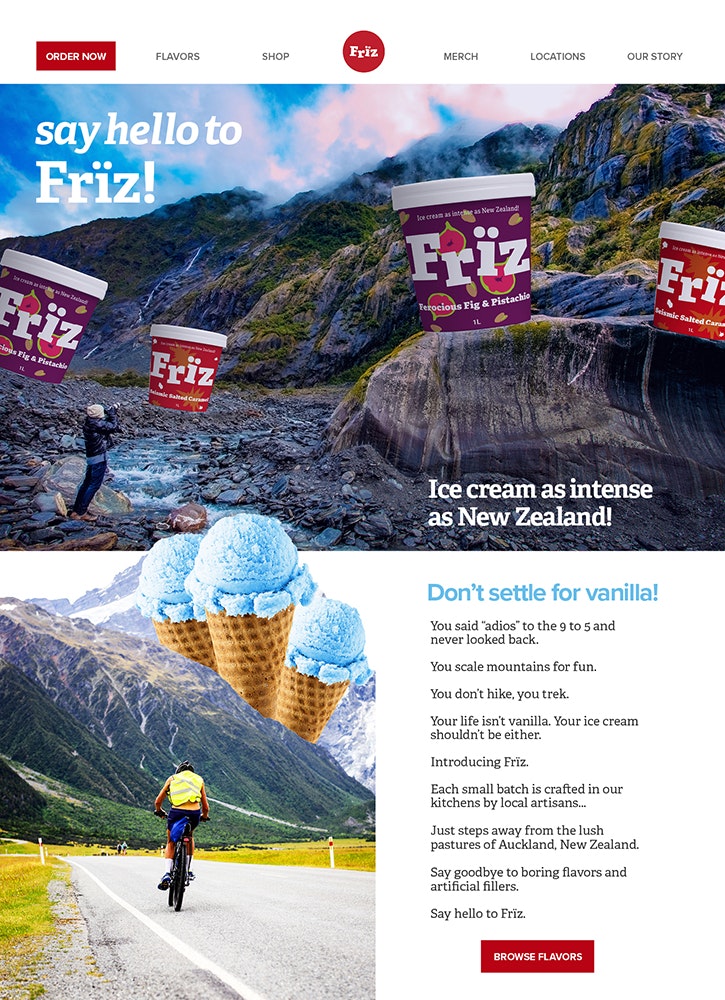
Visual Language
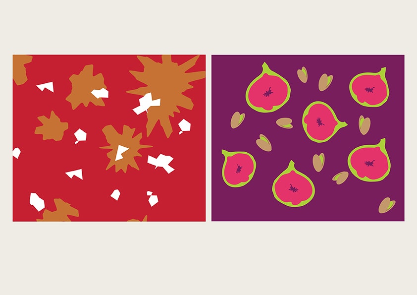
Oversized, surreal ice cream elements interact with epic New Zealand landscapes to exaggerate scale and create a sense of motion and adventure. Highly saturated colors and bold compositions reinforce the brand’s intensity and energy.
Design Choices
- Vibrant, high-contrast photography
- Playful surrealism to avoid typical “natural food” clichés
- Flavor names enhanced to suggest boldness and edge
- Packaging illustrations designed to feel lively and kinetic
Outcome
The resulting campaign positions Frïz as an ice cream for people who don’t live cautiously — turning flavor into an adventure and setting the brand apart in a crowded, sameness-heavy category.
Process Notes:
Flavor names and ingredients were provided in the brief and refined to heighten the sense of intensity. Packaging illustrations were custom-designed to suggest motion and energy, echoing the movement of ingredients and landscapes throughout the system.