
Hand & Harvest
A community-driven grocery brand minus the clichés
Snapshot
Overview: Create a brand identity for a Boulder-based startup grocery store and community space. In addition to retail, the space hosts workshops and classes on cooking, gardening, and wellness. The founders wanted to avoid familiar visual shortcuts — no rustic barns, chickens, or trees.
Role: Brand strategy, identity, copy
Deliverables: Brand concept, naming, visual identity, logo design, copywriting, messaging framework
Type: Concept
Target Audience
Food-obsessed urban shoppers who care about quality and sourcing, but don’t necessarily think of grocery shopping as a meaningful experience...yet.
The Insight
For many city dwellers, “local” and “organic” have become vague buzzwords. What’s missing is a sense of substance — something that feels real, grounded, and human
Brand Concept
A grocery store that feels solid, honest, and intentionally imperfect — more workshop than showroom.
The brand focuses on materiality, craft, and quiet confidence rather than nostalgia or pastoral imagery.

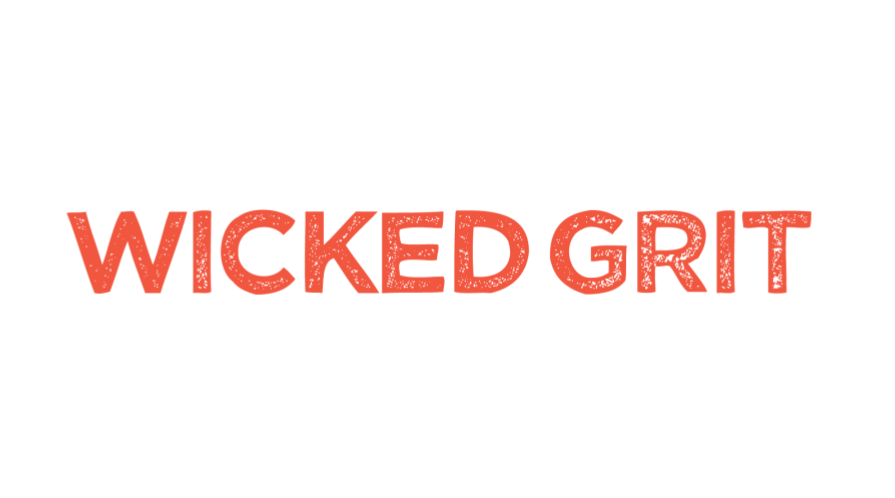
Visual Language
Typography plays a central role. The primary typeface leans into the brand’s key attributes: solid, natural, and imperfect — echoing the textures and inconsistencies of real food and handmade processes.

Copy Approach
All in-store and poster copy was written to feel direct, grounded, and conversational — inviting curiosity without preaching or performative “green” language.


Outcome
The resulting identity positions the store as a community hub rather than just a place to shop — a space for learning, conversation, and connection around food.
The system scales naturally across in-store touchpoints, encouraging repeat visits, familiarity, and everyday connection.


